How does color redefine the building envelope?
In contemporary architecture, colour has become a strategic element in the design of building envelopes. Not only does it condition the visual perception of the building, but it also influences its integration into the landscape, its light behaviour and its ability to convey identity.
With this premise in mind, we present the 2026 colour chart, which celebrates the chromatic diversity of the world we inhabit and, at the same time, offers adaptable, durable and contemporary metal solutions for the buildings of the future.
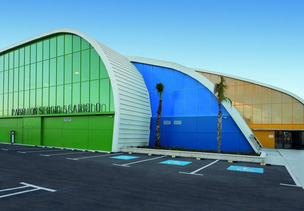
Metallics that capture light: the vibrancy of living façades
Light is one of the most powerful materials in architecture. That is why our new chart highlights metallic finishes, capable of transforming a façade into a changing organism. Under the sun, these tones vibrate, intensify and generate a luminous effect that brings dynamism without being garish.
These are colours that are not only seen: they are felt. They change with the time of day, the season and the weather. They allow the building to interact with its surroundings and become an active part of the urban or natural landscape.
These shades allow you to:
-Convey the idea of luminosity, adding dynamism without being garish.
-Improve the volumetric reading of the building according to the incidence of sunlight.
-Integrate into urban contexts without losing architectural presence.
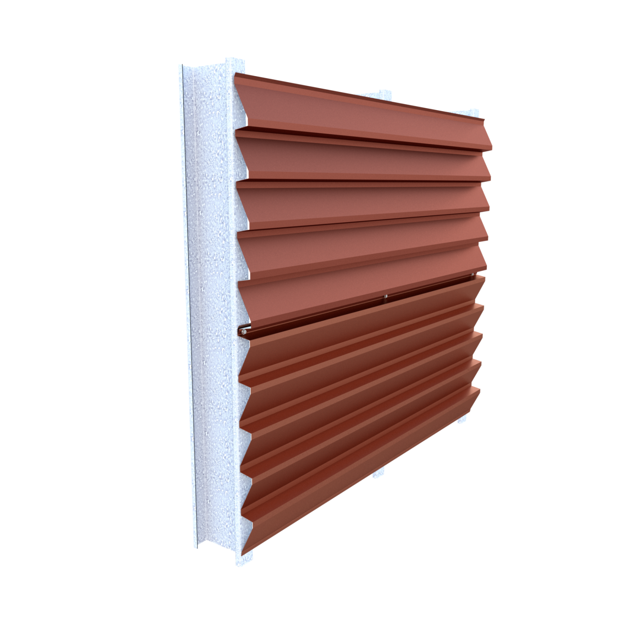
Two new exclusive KingZip aluminium finishes have been added to this family, expanding the creative possibilities for continuous envelopes, roofs and high-performance façades.
Light Oak: natural aesthetics with advanced technical features
Contemporary architecture increasingly seeks an emotional connection with natural materials. However, this quest is not always compatible with the technical demands of current projects.
That is why we are introducing the new light oak wood effect finish: a surface that conveys the warmth, texture and naturalness of wood, but with the durability, stability and resistance of metal. A solution designed for spaces that require closeness, humanity and balance without sacrificing efficiency.
Four sensory universes for intentional design
The 2026 colour chart is organised not only by shades, but also by sensations. Because colour is not just a detail: it is an experience. Each colour group is designed to accompany a different architectural intention:

1.Clarity and freshness
Whites, cool tones and sands that evoke purity, lightness and serenity. Ideal for projects seeking luminosity, visual cleanliness and a discreet but elegant presence.
2.Nature and tradition
Reddish, green and tones inspired by autumn, forests and wineries. A palette that connects with the earth, with what remains. Perfect for rural, heritage environments or projects seeking authenticity.
3.Horizons and calm
Blues reminiscent of open skies and calm seas. Colours that invite contemplation, tranquillity and spaciousness. An ideal choice for spaces seeking to convey well-being and balance.
4.Solidity and modernity
Greys, aluminium, rock, stone and metallics. The essence of contemporary architecture: sober, precise, technological. A palette that speaks of innovation, rigour and character.
An invitation to design with diversity, harmony and personality
The new 2026 colour chart is more than a tool: it is an inspiration. A way of understanding colour as an architectural element capable of transforming the perception of space, reinforcing the identity of a project and generating lasting emotions.
It is a palette designed for architects seeking colour solutions that combine technical performance, aesthetic coherence and expressive capacity. A palette that allows you to design envelopes that dialogue with the environment, reinforce the identity of the project and add long-term value.
If you would like to explore all the shades and finishes, you can access the complete chart here: